Strange Fellows Brewing’s Christine Moulson: Brand & Story Teller
W hen I started the Women and Beer series in 2013, I focused on female brewers because it was such a male-dominated industry, and “brewer” is the person behind that great pint of beer! But there are many other responsibilities in the beer industry that are essential.
In today’s world, a brewery needs to stand out and be noticed. We all love to follow the latest newcomer on Instagram and read updates about a beer launch, with strong brand recognition and captivating visuals. Often, branding is marketed before the beer is even made. How often do we think: who is behind that marketing? Who created the brand, the logo, and the images on T-shirts you buy and wear?
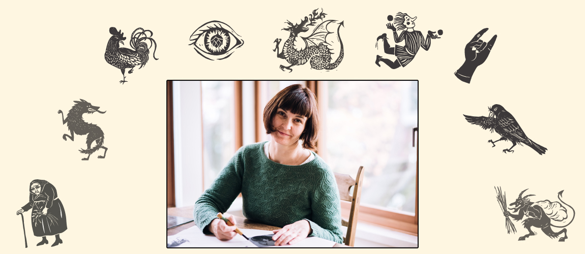
If you have visited Vancouver’s Strange Fellows Brewing or purchased a bottle of their beer, you may have noticed the unique block-print-style images that create the “look” of Strange Fellows. Let me introduce you to Christine Moulson, a partner of the brewery since its inception. She’s the wife of Iain Hill, the man behind the beers. She also happens to be the creative mastermind behind the branding.
Q&A WITH CHRISTINE MOULSON
WHAT BROUGHT YOU TO THIS ROLE?
For many years Iain had wanted to open his own brewery and I was always keen to be involved in the marketing side. When Aaron came into the picture, I was part of the team from the start.
IS THIS YOUR FIRST JOB IN THE BEER INDUSTRY?
Yes. I do seem to have a thing for beverages though, as I was previously involved with a tea company and worked for many years as their Creative Director.
WHAT KIND OF SCHOOLING DO YOU HAVE?
I studied Film & Animation at Emily Carr, not Graphic Design as one might expect. Although I did not pursue a career in Animation, storytelling is central to the work I do, both in the imagery as well as the copy, and how it relates to the product and to us as the consumers.
WHAT DO YOU LOVE ABOUT YOUR JOB?
It’s a very creative industry. I love the challenge of creating and telling the Strange Fellows story. My job allows me to be creative and to research folklore and history, which I really love.
HAVE YOU SEEN MORE EMPHASIS ON VISUALS & MARKETING IN THE INDUSTRY SINCE YOU CAME ON BOARD?
Definitely. I guess because there is more considered marketing around beer in general these days, everyone has had to up their game, so to speak. Much beer branding and design has slowly started moving away from a traditional masculine focus and is more varied and creative.
AS THE BRAND ARTIST, HOW DO YOU GO ABOUT THE PROCESS OF CREATING THE LOOK?
We generally discuss the concept of the beer label as a group before I begin. I am lucky in that I am left mostly to my own devices. I usually take my inspiration from the beer itself, as each beer has its own feeling, history and story, and I take creative clues from there.
Sometimes it’s what comes to mind when I first taste the beer in question. Like when I first tasted Popinjay, the image of a Peacock just popped into my head. Sometimes it’s the feeling or tradition of the beer that suggests a name or a story. Occasionally I will make an image that will have to wait for the right beer to come along. Once a concept takes root, I develop the name, imagery, and the narrative. The story that follows the image is usually inspired by folklore, a collective truth, a shared superstition or archetype that somehow relates to the image.
I knew that I wanted the [Strange Fellows visual identity] to be bold yet classic, so I chose to use block prints as the imagery, for their boldness of line and the way it forces imperfections or naivety into the imagery, and their hand-carved nature reflects the craft of the product itself. The palette is black on ivory, with a sparing use of colour. The image style is inspired by medieval wood block prints and Japanese ukiyo-e prints.
DO YOU EVER HAVE ISSUES WITH CREATIVE BLOCK?
All the time! When that happens, I just have to go off and do something completely different. Inspiration usually comes unexpectedly in the middle of the night, or while doing grocery shopping or something banal like that. Sometimes I have creative block with a deadline looming and I just have to force an idea out, and surprisingly it works. The Strange Resemblance label for example, I did entirely in one day–concept, images, story and layout in about 6 hours.
DO YOU HAVE A FAVOURITE BEER AT STRANGE FELLOWS? WHAT ABOUT THE LABEL?
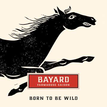
Bayard! Saison is my favorite style of beer, and ours is so good and classic–dry and spicy. The beer is named for Bayard the horse who appears on the label. Bayard is an old character, a magical horse with an uncontrollable free spirit who epitomizes the wild nature of the beer itself. I first became aware of the myth on a beer trip to Belgium. We came across a statue of Bayard in a small town and his legend stuck with me.
DO YOU HAVE A FAVOURITE BEER FROM ANOTHER BREWERY? WHAT ABOUT THE LABEL?
Orval. Iain and I visited Orval many years ago and we had such a great experience. We were treated to a lunch of food that was made, grown or harvested entirely by the abbey – cheese, bread, honey, beer, etc. It was just Iain and I and couple of guys that ran the brewery, and the meal was served to us by a little old monk in a long brown cassock, at long refectory tables in a room with soaring ceilings. The fish on the Orval label tells the legend of a miraculous fish that lived in the pond where the abbey was later established.
ANY LABEL YOU WOULD LOVE TO REDO? AND WHY?
Talisman. I have never been entirely happy with this image and would like her to have a slightly more sinister look, carved in a slightly more naïve style not unlike the style of the Jongleur.
DO YOU HAVE ANY FAVOURITE BREWERY ARTIST THAT INSPIRES YOU? AND WHY?
I love Mikkeller Brewery’s labels, designed by artist Keith Shore. They are so fun and convey a strong feeling.
DO YOU CHOOSE A BEER BY THE LABEL, OR BY THE BEER?
I am guilty of this all the time! I find it quite difficult to buy something with a bad label, regardless of how good the product inside may be.
HOW IMPORTANT IS THE VISUAL SIDE OF THE INDUSTRY?
I like to think it’s very important. If you have a good product, that should be reflected in your visuals and in all written copy which tells the story of who you are as a company. With Strange Fellows, I hope our branding conveys our respect of and our roots in tradition (that’s the “Old World Inspired” part), through the use of old lore and archetypal characters.
THERE IS A CAN LABEL RELAUNCH IN THE FALL. WHAT WILL BE INVOLVED IN THIS, AND WHY?
In switching our cans from printed sleeves to actual printed cans the opportunity arose to redesign and I jumped on it, wanting to simplify the look a little. Our bottle label design is quite minimal, and I wanted to bring the can design in line with this. The images are bigger and many of the changes are subtle but overall effective and I am quite excited about it.
Now for more about Christine’s husband…
..and the story behind their brewery!
Thank you so much for this interesting peek into the mind behind the (only!) cans we keep displayed so proudly on our kitchen shelf! That “old world” feeling, but done exactly to our taste of today. We “got into” Strange Fellows because of the unparalled design – and have stayed for the taste! Love it, and just wish they sold shirts with some of Christine’s designs…Nocturnum most of all! :)